Usability Testing and Redesign

Supreme is a luxury brand which appears mainly to young people with its distinctive styles and fashion ventures. The brand is generally targeted at skateboarding and hip-hop cultures.
Summary of Usability and Accessibility issues
The critical issues need to be addressed in a website redesign of Supreme.
Efficiency
Participants couldn’t search for a specific item on the home page. The redesign will improve this problem by adding filters, putting categories of products on the landing page, and redesigning the layout.
Lack of Convention
It is conventional to put images with models presenting garments on fashion websites’ home pages. The redesign will relocate navigation bars for the same reason.
Sizing and Delivery
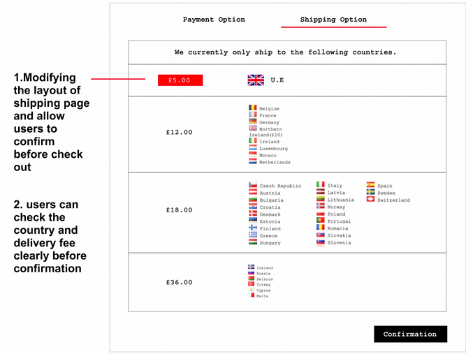
Participants spent much time looking for the size during the task. The redesign will minimise users’ memory load by presenting size information on product pages. Besides, the shipping page isn’t a common category on the navigation bar. The redesign will give shipping information before checking out for logical sequence.
Errors Identification
The input error setting only informs users until pressing send icon. The contact page and Payment options page lack a sophisticated design to remind users of typing errors. The redesign will improve this problem by adding red frames on the input tab while typing. Additionally, there is no confirmation before removing items from the basket.
Alternative texts
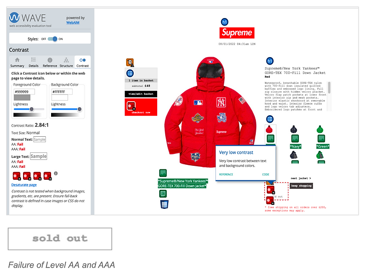
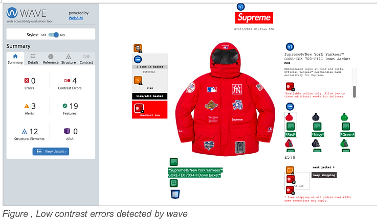
Supreme website lack of alternative texts during the inspection by Wave.
User control and colour contrast
It is essential to let users know which page they are on websites. Most of the pages on Supreme websites don’t have page titles.
User Task Identification

The survey was made to identify what respondents cared for the most while completing purchases on fashion e-commerce websites. There were 78 young respondents. As seen in this figure, the top three results of this survey are “images”, “search”, and “delivery”. The total percentages of these three results are over 20%. The task was formed according to these three results to proceed.
Setting and sample
Our team recruited 16 participants through convenience sampling.
Three task statements
(A) Finding a jacket you wanted to wear in winter
(B) Using the search function to pick the jacket of your size
(C) Finding delivery and shipping information for this jacket
The flow to finish the task


SUS Total Score
24.5
The total SUS score of Supreme is 24.5. A score below 50 reveals serious customer satisfaction issues. A score is generally considered “good” from 75 and passable or correct between 50 and 75. Based on research, a SUS score above 68 would be considered above average ranking.
The most serious problem of Supreme is the frequency of willingness to use it in the future. In terms of simplicity of using and learning the system, Supreme are extremely low.
Biometrics
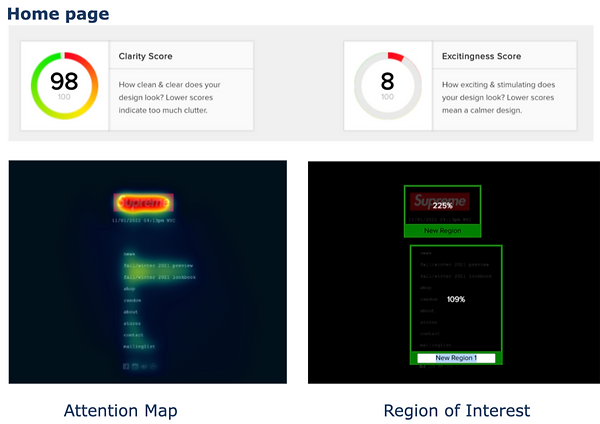
The attention of users is mainly located on the Logo, which is beneficial for the promotion of the brand. However, the navigation bar is a key element making an impact on control of users. The ROI percentage of it is half compared to the Logo.

Attention Map
Perception Map
The navigation bar is completely out of the region of users’ perception and attention, which may make users spend more time looking for it, leading to feeling inconvenient.
The attention map indicates the Logos pattern of the products on images that draw more attention. Additionally, the excitingness score of the Shop page is low and needs to be improved.

Users can perceive most of the design elements on this page, including the texts of categories and images of most jackets. The clarity map indicates how clean and clear the design is. The green parts are the clearest parts, which are primarily composed of images.

Most perception areas of the Sizing page are located on the upper left side, which may cause by the users’ reading habits.

Attention Map
Perception Map
The most common shipping country, the U.K., doesn’t attract the most attention on this page. Users’ perception and attention focus on the longest list of countries. The redesign should try to adjust the layout and add the default of users’ location to test again.
Accessbility
The Wave software was used to uncover more detailed accessibility issues and inspect colour contrast.

Redesign

Product Page

Redesign of Home Page with checking of Biometrics

Putting a big horizontal image and photos with models of home page. The redesign excitingness score significantly increases while the original version is merely 8%. Adding these types of photos is also a conventional design to fits users’ mental models and expectations.
Redesign of Size Information

Supreme website puts size information on the Navigation bar of the home page, which maximizes users’ memory load. The redesign used a pop-up of a size guide to improve the problem of recognition rather than recall for users.
Redesign of Basket Page


This design aims to tackle the problem of error prevention by the conformation of confirmation before removing an item.
Redesign of shipping Page
Conclusion
The unique layout and minimal brand visual style of Supreme's website is a key factor which impacts confusion of information architecture and sequence problems for users. The balance of brand image between accessibility and usability issues is noteworthy during the evaluation of Supreme.
Shop Page
Thanks for your time!